Call Center Dashboards: Drive Efficiency, CX & ROI for CXOs
Think of a call centre dashboard as the mission control panel for your entire customer operation. It takes what seems like a million different data points and organises them into one clear, easy-to-read screen, giving you a live and historical view of everything that matters.
What Are Call Centre Dashboards and Why CXOs Should Care
Imagine trying to pilot a commercial airliner without an instrument panel. That’s exactly what running a modern contact centre without a proper dashboard is like. For a CXO, these dashboards aren't just for reporting—they're the strategic cockpit for your entire customer experience.
This isn't about getting lost in the weeds of daily calls. It’s about having a high-level, real-time feed of intelligence that helps you steer the ship, manage budgets effectively, and make the big decisions that boost customer loyalty and your bottom line.
From Raw Data to Strategic Insight
A call centre dashboard's real power is its ability to cut through the noise. It takes streams of raw data—from call queues and agent performance to customer sentiment—and turns it all into answers you can act on.
It helps you get immediate clarity on critical business questions:
- Are we hitting our service level agreements (SLAs)? A quick glance will tell you if you're meeting the industry gold standard of answering 80% of calls within 20 seconds. For a director overseeing a 500-seat center, falling short of this by just 10% can mean thousands of frustrated customers and a direct impact on brand perception.
- Do we have the right number of people working? Dashboards expose your peak hours and call patterns, letting you staff smarter. For example, a retail company might discover a 40% spike in calls in the first hour after a major online sale goes live. This data-driven approach can slash agent burnout and cut overtime costs by as much as 15-20%.
- Where are customers getting stuck? A spike in call abandonment rates from 2% to 8% or a long Average Handle Time (AHT) acts like a flare, showing you exactly where you have an operational bottleneck that needs fixing.
This kind of strategic view is absolutely essential in today's market. Take India's call centre industry, for example, which was valued at a massive USD 33 billion in 2023. In a sector that lives and dies by efficiency and service quality, a dashboard is the primary tool for staying ahead. You can read more on the scale of this sector in this research on the Indian call centre market.
A dashboard moves you from thinking you have a staffing issue to knowing you have a 30% agent deficit during Tuesday's 2 PM peak, allowing for precise, cost-effective action instead of guesswork.
The CXO’s Strategic Advantage
For VPs, Directors, and CXOs, the real worth of a call centre dashboard is measured in business outcomes, not just operational stats. It’s the bridge connecting your contact centre's performance directly to the company's financial health.
A well-designed dashboard gives you the power to:
- Forecast and Manage Budgets: Accurately predict call volumes and staffing requirements based on historical data and marketing calendars. For instance, anticipating a 20% call increase post-Diwali sale allows you to build a precise, defensible budget for seasonal hiring, eliminating last-minute scrambles.
- Drive Revenue and Retention: Spot patterns in successful sales calls or, conversely, identify the root causes of customer churn. One B2B SaaS company used their dashboard to discover that customers who had more than two technical support calls in their first 90 days had a 60% higher churn rate. This insight led to a proactive onboarding program that cut churn by 15%.
- Validate Technology Investments: See the real impact of that new CRM, training programme, or AI chatbot. You can measure its effect on core metrics like First Call Resolution (FCR) and Customer Satisfaction (CSAT). If a new AI bot handles 30% of routine queries, your dashboard can quantify the ROI in terms of agent hours saved and cost per contact reduction.
Ultimately, a call centre dashboard gives you the clarity you need to lead. It helps you move from constantly putting out fires to building a proactive, data-informed strategy. It turns your contact centre from a cost centre into a genuine engine for growth. Explore our guide on how to make this happen with our insights on contact centre BPO strategies.
The Strategic KPIs Every CXO Dashboard Must Have
A high-level call centre dashboard filled with vanity metrics is just noise. For a CXO, the aim isn't to track everything, but to track the right things—the key performance indicators (KPIs) that tie call centre activity directly to the business's bottom line. This means moving beyond raw numbers to tell a story of profitability, customer loyalty, and operational muscle.
An effective CXO dashboard groups KPIs into three core areas. This structure makes sure every metric answers a critical business question, turning data into a powerful tool for decisive leadership.
Financial Impact Metrics
This is where your dashboard starts speaking the language of the boardroom. It's all about translating what happens on the phones into direct financial outcomes. These metrics are your best friends when it comes to defending budgets, managing costs, and proving the call centre is a revenue driver, not just a cost centre.
Here are the key financial KPIs to watch:
- Cost Per Contact: This is a straightforward calculation: total contact centre expenses divided by the total number of contacts handled. If your Cost Per Contact is creeping up, it could be a sign of inefficiency. For example, a VP of Finance might see it rise from ₹400 to ₹450 over a quarter. On the other hand, seeing it drop to ₹350 per call after rolling out a new IVR provides a crystal-clear return on investment, justifying the technology spend.
- Revenue Per Call: For any team with a sales function, this is non-negotiable. It tracks the average revenue generated from each successful call. For a Director of Sales, monitoring this helps pinpoint top-performing agents whose RPC is 25% above average and identify successful up-sell campaigns, giving you a blueprint for success that you can replicate across the entire team.
Customer Loyalty Metrics
Sustainable growth is built on a foundation of customer loyalty. These KPIs measure the quality of your customer interactions and how they affect long-term relationships and brand reputation. They offer a direct window into how your customers are feeling and how much effort they have to put in.
The essential loyalty metrics for your dashboard are:
- Net Promoter Score (NPS): This classic metric gauges a customer's willingness to recommend your company. A low or falling NPS is a huge red flag for potential churn. For example, a sudden plunge from +45 to +20 right after a new product launch should sound the alarm for the Chief Product Officer, prompting them to get product and support leaders in a room immediately to analyze call transcripts.
- Customer Effort Score (CES): This KPI asks a simple but powerful question: "How easy was it to get your issue resolved?" A high effort score is a recipe for customer frustration. In fact, reducing that effort is a proven way to build loyalty; companies that make low-effort experiences a priority can see a 94% increase in their customers' intent to repurchase. A CXO seeing a high CES can initiate projects to streamline IVR menus or improve website self-service options.
Operational Excellence Metrics
These metrics give you a pulse on the day-to-day efficiency and effectiveness of your call centre operations. For a CXO, they offer a snapshot of the operational health that underpins both your financial performance and the customer experience you deliver.
Just focusing on one operational metric, First Call Resolution, can create a massive domino effect. A mere 5% improvement in FCR can slash operational costs by over $500,000 annually in a mid-sized centre and directly boost CSAT scores by 15%.
Important operational KPIs include:
- First Call Resolution (FCR): This is the percentage of calls where the customer's problem is solved on the very first contact, with no need for a follow-up. A high FCR (you should be aiming for 70-75%) tells you your agents are well-trained, your processes are sharp, and your customers are leaving happy. A Director of Operations seeing a dip in FCR to 60% knows it's time to investigate agent training or knowledge base gaps.
- Agent Utilisation: This measures the percentage of time an agent is actively working on call-related tasks compared to their total logged-in time. While you want this to be high, a rate that’s consistently over 90% can be a warning sign of impending agent burnout, leading to higher turnover costs. A VP of HR would watch this metric closely to ensure workforce sustainability.
- Service Level: A true cornerstone metric, often shown as "80/20," which means 80% of calls are answered within 20 seconds. For VPs and Directors, this is a real-time gauge of staffing adequacy and how accessible you are to your customers. Getting this right starts with a solid grasp of how to calculate it; you might find our guide on the service level formula helpful.
As you can see from the diagram below, a strategic dashboard works like a pilot's cockpit. It pulls from multiple data streams and consolidates them into a single, clear view that guides your decisions.
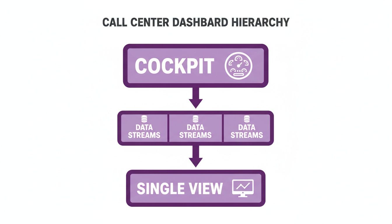
This hierarchy shows that for executives, the dashboard’s job is to distill complex information into a simplified "cockpit view" for high-level guidance.
Essential Call Centre KPIs And Their Business Impact
This table outlines the most critical Key Performance Indicators (KPIs) for any call centre, explaining their calculation and strategic business value.
| KPI Category | Metric | What It Measures | Strategic Importance for CXOs |
|---|---|---|---|
| Financial | Cost Per Contact | Total operational cost divided by total contacts handled. | Directly links operational efficiency to profitability and helps justify tech investments. Example: A 10% reduction saves ₹2M annually. |
| Financial | Revenue Per Call | Average revenue generated per call, primarily for sales-focused teams. | Identifies high-value activities and top performers, guiding sales strategy and training. Example: Pinpoints agents with 25% higher cross-sell rates. |
| Loyalty | Net Promoter Score (NPS) | Customer willingness to recommend the brand, on a scale of -100 to +100. | Provides a high-level indicator of brand health and future growth potential; a leading indicator of churn. Example: A 10-point drop signals a major service issue. |
| Loyalty | Customer Effort Score (CES) | The ease of a customer's interaction and problem resolution. | Directly correlates to customer loyalty; a high-effort experience is a major driver of dissatisfaction. Example: Correlates high effort with a 30% lower repurchase rate. |
| Operational | First Call Resolution (FCR) | Percentage of calls resolved on the first attempt without a follow-up. | A powerful driver of both customer satisfaction (CSAT) and operational cost reduction. Example: Improving FCR by 5% can raise CSAT by 15%. |
| Operational | Agent Utilisation | The percentage of an agent's paid time spent on call-related activities. | Balances productivity with employee well-being; helps prevent agent burnout and turnover. Example: Sustained 95% utilization predicts a 20% increase in attrition. |
| Operational | Service Level | The percentage of calls answered within a predefined time threshold (e.g., 80% in 20s). | A real-time measure of customer accessibility and staffing effectiveness. Example: Missing the 80/20 target correlates with a 5% drop in CSAT. |
By carefully choosing and organising KPIs across these three pillars—financial, loyalty, and operational—CXOs can build powerful call centre dashboards. These dashboards move beyond simple reporting and become a dynamic tool for steering strategy, driving growth, and building a resilient, customer-centric organisation.
Designing Dashboards for Executive Decision-Making
When you're designing a dashboard for a C-level leader, you have to throw out the old rulebook. It's not about cramming in every piece of data you can find. It’s about delivering a handful of critical insights that can guide a high-stakes business decision—all in the time it takes to drink a sip of coffee. An executive dashboard isn't a report; it's a strategic compass pointing the way forward.
The whole point is to cut through the noise. Your design philosophy needs to shift from data overload to strategic distillation. You’re telling a story with numbers, one that clearly highlights the wins, flags the risks, and uncovers the opportunities that matter most to the bottom line.
From Cluttered Reports to Strategic Clarity
There's a world of difference between what a call centre manager needs to see and what a CXO needs. A team lead obsesses over real-time queues and agent adherence. A VP or Director, on the other hand, needs the 30,000-foot view. The real work is transforming a dense, operational report into a clean, strategic summary that gets straight to the point.
An executive’s dashboard should answer big-picture questions at a glance:
- Are we on track to hit our quarterly revenue and customer retention targets?
- Which product lines or regions are costing us the most in support? For example, is our "Pro" subscription generating 40% of support calls despite being only 15% of our user base?
- Is our Customer Effort Score (CES) getting better or worse, and what’s driving that trend?
To pull this off, you need a strong visual hierarchy. Your most important KPIs, like Net Promoter Score (NPS) or Cost Per Contact, should be front and centre. Everything else is just supporting context. For a deeper dive into this design approach, this guide to building a business intelligence dashboard is an excellent resource.
The Power of Role-Based Views and Visual Cues
Not every leader cares about the same numbers. A CEO wants a bird's-eye view of business health, connecting the dots between customer experience and overall profitability. A Regional VP needs to zoom in on their market, seeing how it stacks up against others. This is where role-based views become indispensable.
For instance, a CEO's dashboard might feature:
- Overall Customer Lifetime Value (CLV) trends over the last 12 months, with a goal of a 10% year-over-year increase.
- Total Cost of Service as a percentage of company revenue, aiming to keep it below 8%.
- Company-wide NPS benchmarked against key competitors, showing a live score of +52 versus the industry average of +40.
Meanwhile, a VP of Operations would probably find this more useful:
- First Call Resolution (FCR) rates, broken down by individual call centre sites, revealing that the Pune site is at 82% while the Bangalore site lags at 68%.
- Agent Attrition Rate and Agent Utilisation costs compared across different regions.
- Service Level Adherence for your most valuable customer segments, ensuring that 'Platinum' customers are consistently hitting a 95/10 service level (95% of calls answered in 10 seconds).
Simple visual cues are your best friend here. A straightforward green, yellow, and red system immediately tells a leader if things are on track. A glaring red on the Customer Satisfaction (CSAT) metric is an instant alarm bell, while a steady green on FCR confirms that your latest training program is actually working.
This dashboard is a perfect example of cutting through the clutter to present key metrics in a format that's quick and easy for an executive to understand.
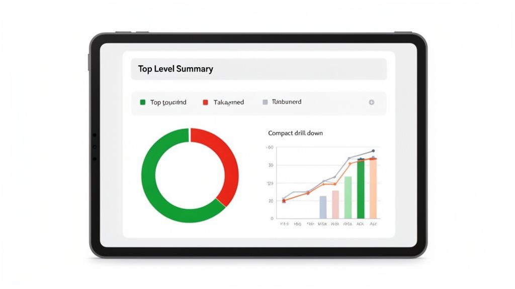
By using clean donut charts and simple graphs, it gives a quick-hit summary of performance against goals—ideal for a leader on the move.
The ultimate test of an executive dashboard is its '60-second value.' A leader should be able to open it, understand the current state of the business, and identify the one or two most critical areas needing attention, all within a single minute.
And let’s not forget that executives are rarely tied to their desks. A mobile-first design is no longer a nice-to-have; it's a necessity. Leaders need to check in on performance between meetings or while travelling. A responsive dashboard that looks and works great on a smartphone is what makes critical insights truly accessible. When you nail these principles, you’re not just building a report—you’re creating a command centre for strategic leadership.
Dashboard Strategies for High-Growth Industries
While it’s easy to talk about KPIs in theory, the real value of a call centre dashboard comes down to how it performs in the trenches of a specific industry. What a VP of Operations in EdTech cares about is a world away from the priorities of a CXO in banking or a Director in real estate.
A one-size-fits-all dashboard is a recipe for mediocrity. A truly strategic dashboard is tailored to track the handful of metrics that directly fuel growth and competitive advantage in your specific market. It’s about moving the conversation from "how many calls did we take?" to "how much revenue did the contact centre drive?"
EdTech: From Leads to Enrolment
In the hyper-competitive EdTech space, everything revolves around the journey from a prospect's first call to their final enrolment. A VP of Admissions needs a dashboard that visualises this entire conversion funnel, not just isolated call stats.
For an EdTech call centre, the dashboard must highlight:
- Lead-to-Enrolment Conversion Rate: This is the north-star metric. The dashboard has to slice and dice this by counsellor, marketing campaign, and lead source to show what’s actually working. For instance, discovering that webinar leads convert at 7% while social media leads only manage 2% is a powerful insight that allows for immediate budget reallocation away from underperforming channels.
- Counsellor Productivity: This goes beyond simple call volume. You want to track meaningful actions like successful follow-ups per day (aiming for 50+) and the average number of touchpoints it takes to secure an enrolment.
- Average Revenue Per Enrolment: This simple metric helps the team prioritise high-value programmes. A dashboard might show that the Data Science course generates an average revenue of ₹1,20,000 per enrolment, while a basic marketing course only generates ₹40,000.
In EdTech, small wins have massive financial ripple effects. For a medium-sized company, nudging that lead-to-enrolment rate up by just 3% can directly add millions of rupees in new annual revenue. That’s a data point that gets attention in any board meeting.
BFSI: Compliance and Efficiency
Now, let's switch gears to Banking, Financial Services, and Insurance (BFSI). For a CXO in this sector, the dashboard's role changes dramatically. While customer experience is still on the radar, the top priorities are ironclad compliance, fraud prevention, and operational efficiency within a minefield of regulations.
An effective BFSI dashboard must put these metrics front and centre:
- Customer Verification Time: How long does it take an agent to complete the Know Your Customer (KYC) process? Shaving just 10 seconds off per call might not sound like much, but across thousands of daily interactions, that can free up over 1,500 agent hours every month, a direct cost saving a CFO can appreciate.
- Compliance Adherence Score: This is a non-negotiable metric, usually drawn from quality monitoring. It tracks whether agents are sticking to mandatory scripts and disclosure protocols. A real-time alert when adherence dips below 98% isn't just useful—it can prevent crippling regulatory fines that run into crores.
- First Call Resolution (FCR) for High-Stakes Issues: When a customer calls about suspected fraud or a disputed transaction, solving it on the first attempt is paramount. A dashboard showing an FCR of 95% for fraud-related calls demonstrates strong risk management and builds customer trust.
Real Estate: Bookings and ROI
In real estate, the phone call is the critical bridge between a fleeting digital interest and a tangible site visit. A director's dashboard needs to offer a crystal-clear view of which agents and marketing channels are best at getting prospects through the door of a property.
The screenshot below gives a good idea of a dashboard built for an industry like real estate, focusing heavily on lead sources and agent-specific results.
This view provides an immediate, at-a-glance understanding of what’s driving real-world results by breaking down lead performance and tracking key conversion points.
A Real Estate Director’s dashboard will be laser-focused on:
- Site Visit Bookings Per Agent: This is the most direct measure of an agent’s ability to turn an inbound query into a genuine sales opportunity. A top agent might book 15 visits a week, while a new agent is only booking 4.
- Lead Source ROI: By tracking which channels—be it 99acres, MagicBricks, or social media ads—generate the most site visits for the lowest cost, leaders can make marketing decisions backed by hard data, not guesswork. For example, they might find that MagicBricks leads cost ₹500 each but convert to visits at 10%, whereas Instagram leads cost ₹200 but only convert at 2%.
- Lead-to-Booking Rate: What percentage of leads are actually converting into a scheduled site visit? If one agent has a booking rate of 8% while the team average is a paltry 3%, their call recordings instantly become a priceless training resource for the whole team.
By building a dashboard that focuses on these industry-specific KPIs, you transform it from a simple monitoring tool into a strategic weapon. It shows you your most profitable channels, identifies your top performers, and gives you the actionable intelligence needed to stay ahead of the competition.
The Smart Move: Adding Predictive Intelligence with AI
Traditional reports are just snapshots of the past. They tell you what has happened, but they offer little insight into what's coming next. For any VP, Director, or CXO, this is like driving by only looking in the rearview mirror. The future of truly effective call centre dashboards lies in predictive intelligence powered by AI.
This isn't just a minor upgrade; it's a fundamental change in philosophy. We're moving away from simply reacting to problems and stepping into a world where we can proactively shape our strategy. Your dashboard transforms from a historical logbook into a forward-looking guide for your most critical business decisions.
From Reactive Firefighting to Predictive Strategy
At its core, the value of AI here is its incredible ability to find patterns in mountains of data—patterns no human could ever hope to spot. This lets you forecast issues and get ahead of them.
What does this look like in practice for an executive?
- Call Volume Forecasting: Imagine knowing, with up to 95% accuracy, that a marketing campaign for a new credit card will generate a 30% increase in calls next week. AI models analyse past campaigns, seasonal trends, and market data to give you this crystal ball. This means a Director of Operations can approve temporary staff or adjust shifts with confidence, avoiding both the cost of idle agents and the service-level nightmare of being understaffed.
- Real-Time Sentiment Analysis: Modern AI doesn't just count calls; it understands conversations. It can analyse the tone and language of live calls and flag an at-risk customer in real-time. A dashboard can show a CXO that customer frustration mentions have spiked by 20% in the last hour, allowing them to immediately investigate if a system is down or a policy is causing widespread anger.
This isn't some far-off future trend. The shift is happening right now. In 2024, the India call centre AI market was already valued at USD 103.8 million, and it's on track to explode to USD 452.5 million by 2030. You can explore more about this rapid growth in the Indian call centre AI market.
A Unified View for a Blended Workforce
More and more, our teams are a mix of human agents and their AI counterparts (chatbots, voicebots). For a CXO, trying to manage this new reality without a unified view is a recipe for disaster. You need a single source of truth to see how your entire operation is performing and decide where to invest in automation next.
This is where your API integrations become your best friend. For example, a platform like DialNexa can feed data directly from your AI agents into the same dashboards your human team uses. This gives you a complete, holistic picture and helps answer the big strategic questions like, "Our AI bot resolves 40% of tier-1 queries, saving us ₹50 lakhs annually. Should we invest another ₹20 lakhs to expand its capabilities to tier-2?" To get the most out of this, it's worth getting familiar with the latest in automating customer support with generative AI.
The dashboard below is a great example of this in action. It goes beyond simple metrics to offer predictive forecasts for both performance and staffing.
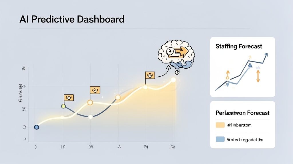
This kind of intelligence allows leaders to stop guessing and start making proactive decisions about where to allocate their resources.
Think of it this way: a traditional dashboard tells you your Average Handle Time was 6 minutes last week. A predictive dashboard tells you that, because of an upcoming product launch, your AHT is likely to jump by 30% next Tuesday—unless you get ahead of it by equipping agents with specific new articles for their knowledge base.
By bringing AI into the fold, you’re turning your call centre dashboard from a simple reporting tool into an intelligent command centre. It’s what allows you to scale efficiently, manage a blended workforce with clarity, and make the strategic calls that put you miles ahead of the competition.
Frequently Asked Questions by Executive Leaders
As a leader, you’re focused on the big picture: strategy, growth, and the bottom line. When considering any new tool, including a call centre dashboard, you need straight answers that connect directly to business outcomes, not a list of technical features. Here are the most common questions we field from VPs, Directors, and the C-suite.
How Quickly Can We Implement a Dashboard and See ROI?
This is often the first question, and for good reason. With a modern, API-first solution, a foundational dashboard can be up and running in a matter of weeks, not quarters. The return on that investment is visible even faster, often within the first quarter, through tangible cost savings and efficiency gains.
Here are some real-world examples:
- Smarter Staffing: Using accurate call volume forecasts, one of our EdTech clients cut their overtime costs by 18% in the first two months alone, saving over ₹15 lakhs annually.
- Faster Resolutions: A BFSI partner used their dashboard to spot process bottlenecks, which helped them shave 25 seconds off their Average Handle Time (AHT). That translates to thousands of saved agent hours every year, a direct impact on the P&L.
The most immediate ROI is often the strategic shift from playing catch-up to getting ahead of problems, preventing costly service issues before they ever reach your customers.
How Do We Ensure Our Team Actually Uses the New Dashboard?
This is a critical concern for any technology investment. A dashboard nobody uses is just an expensive piece of digital wall art. The secret to driving adoption comes down to one word: relevance.
The key to adoption is making the dashboard an essential tool for daily success, not just another corporate mandate. An agent should feel it helps them win, not that it's simply a way to be micromanaged.
This means you need to think about role-specific views that make each person’s job genuinely easier and more impactful.
- For Agents: A personal view showing their own First Call Resolution (FCR) rate and customer satisfaction scores, perhaps with a leaderboard to spark some friendly competition.
- For Managers: A team-level dashboard that tracks collective metrics like Service Level adherence and helps them spot coaching opportunities by comparing agent performance. For example, identifying an agent with a low FCR but high call volume.
- For CXOs: A high-level, strategic overview focused on metrics like Cost Per Acquisition and Customer Lifetime Value, directly linking call centre performance to the company’s profit and loss statement.
When every user sees data that helps them achieve their specific goals—whether it's hitting a bonus, coaching a team effectively, or reporting to the board—the dashboard becomes something they want to use, not something they have to.
Can These Dashboards Integrate with Our Existing CRM and Software?
Absolutely. In fact, if a dashboard can't integrate with your other systems, it's not a modern solution. A dashboard that lives in its own little world has very limited strategic value.
Today’s platforms are designed to connect smoothly with your entire tech stack using APIs (Application Programming Interfaces). This lets you pull data from all your different sources into one unified, coherent picture.
For a CXO, this means you can see a single dashboard that shows:
- Call data from your telephony system (like call volume and AHT).
- Customer history from your CRM (like Salesforce or HubSpot), including their purchase history and value.
- Ticket information from your helpdesk software (like Zendesk), showing open and resolved issues.
This isn't just about convenience; it’s about breaking down the data silos that create blind spots in your business. It means you can finally see the entire customer journey in one place—from the marketing campaign that brought them in, to the service call that made them a customer for life.
What Is the Single Biggest Mistake to Avoid When Designing a CXO Dashboard?
By far, the most common and costly mistake is information overload. There's always a temptation to build a "data dump" dashboard, throwing every possible metric onto one screen. This is a recipe for disaster. It creates a cluttered, confusing interface that gets ignored because it fails to provide clear direction.
A senior leader’s time is their most precious resource. Your dashboard needs to deliver clarity, not complexity.
To avoid this trap, follow a simple rule: stick to 5-7 core KPIs that tie directly to your highest-level business objectives. For a CEO, that might be metrics like Customer Lifetime Value, Cost of Service as a % of Revenue, and overall NPS. For a VP of Sales, it would be Lead-to-Close Ratio and Revenue Per Call. Anything that doesn't directly support these top-tier goals is just noise and belongs on an operational dashboard, not yours. The aim is to create a tool that answers your most critical questions in seconds, not one that requires a data science degree to understand.
Ready to move from hindsight to foresight? DialNexa Labs Private Limited provides AI-powered call centre dashboards that deliver the predictive intelligence you need to drive growth and efficiency. Explore how DialNexa can transform your customer operations today.
[…] your team still reviews feedback in spreadsheets, study how modern call centre dashboards that combine CX and operational metrics help leaders trace a DSAT spike back to a queue, script, routing rule, or handoff point quickly. […]
[…] It also reduces migration friction. Number porting support and guided onboarding help companies preserve continuity while shifting to a cloud-based setup. That makes it a sensible choice for leadership teams focused on stabilising operations first, then improving reporting and workflow control through better call center dashboards for performance management. […]
[…] CXOs building oversight across distributed sales units, a structured call centre dashboard approach is often the difference between a telephony rollout and a performance […]
[…] It is how voice should be governed, measured, and integrated. A useful reference point is a set of call centre dashboard reporting practices that connect response quality, volume, and outcome tracking to commercial […]
This is a strong and insightful piece that clearly connects call centre metrics with real business outcomes, helping leaders move from operational reporting to strategic decision-making. The emphasis on AI, predictive intelligence, and industry-specific dashboards makes it especially valuable for modern CX and business leaders.
[…] administration task. One effective approach is to review staffing alignment alongside the same call center dashboards used in leadership reviews, so service levels, labour efficiency, and commercial outcomes are assessed […]
[…] a practical model of how teams structure visual oversight for frontline execution, call centre dashboards and KPI design is a useful reference […]