

KPI for Sales: A Director’s Blueprint for 2026
A CRM full of 20 to 49 tiles still leaves leaders asking the same question at the weekly review, are we going to hit number? That's the core problem with most kpi for sales dashboards. They collect noise, not decisions, and they force VPs, Directors, and CXOs to guess which levers will change revenue.
The better question is narrower and harder. Which 3 to 5 KPIs predict revenue for this specific motion? In India, that matters even more because high-volume sectors like EdTech, BFSI, real estate, and e-commerce live and die by lead speed, funnel conversion, and call quality, not by vanity charts. Sales KPI frameworks from IBM, Salesforce, and NetSuite all treat conversion rate, quota attainment, sales cycle length, pipeline coverage, lead-to-sale %, quote-to-close ratio, and average sales cycle length as core commercial metrics, which is exactly why the best dashboard is usually the smallest one.
Table of Contents
- Why Most Sales KPI Dashboards Fail
- The Four Families Every Sales KPI Stack Needs
- The Essential Sales KPIs With Formulas and Benchmarks
- How to Set Targets Your Board Will Actually Trust
- Choosing KPIs by Role and Industry
- Voice-Led and Call-Heavy Sales KPIs Most Guides Miss
- Dashboard Design and Reporting Cadence That Drives Action
- A 30-Day Rollout Plan and the Mistakes That Break Forecasts
Why Most Sales KPI Dashboards Fail
Most sales teams don't have a KPI problem, they have a discipline problem. The dashboard shows everything, so nobody trusts anything. By the time a VP Sales opens the CRM, the screen is packed with activity, pipeline, and revenue tiles, yet the question at the end of the meeting is still simple, can we make the quarter?
The reason is blunt. Too many dashboards mix lagging and leading signals, then bury the few metrics that predict revenue. Conversion rate, quota attainment, and sales cycle length matter because they link lead flow, operating efficiency, and revenue outcomes, and IBM's sales metrics guidance treats them as core control points for that reason. If you want a board conversation instead of a report dump, you need fewer metrics and stronger causality.
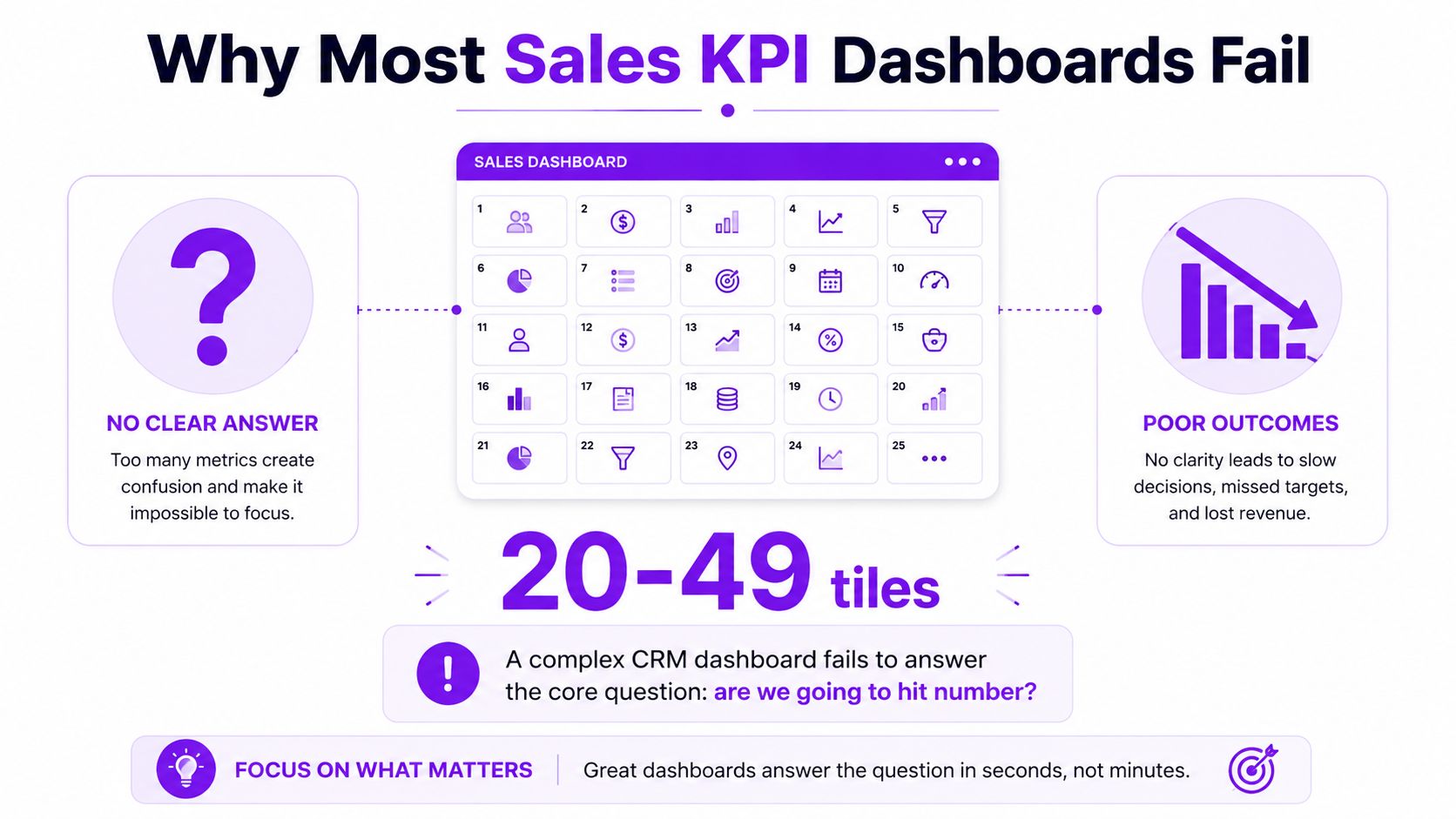
The problem is not visibility, it's overload
A director doesn't need more tiles. A director needs a dashboard that says whether the funnel is healthy, whether the team is working it, and whether the quarter is still alive. That's why a 2-point lift in conversion, for example from 2% to 4%, is commercially bigger than pushing more top-of-funnel volume, because the same lead pool produces more closed-won output, as shown in IBM's KPI framing for conversion and funnel health (IBM sales metrics).
Practical rule: if a metric doesn't change a decision, it doesn't belong on the executive view.
The right starting point is not “what are all the possible sales KPIs?” It's “which few KPIs predict revenue for our motion, in our geography, with our cycle length?” That's the lens that keeps dashboards from turning into decorative CRM wallpaper. For a broader sales-ops perspective, it's worth comparing your current stack with key pipeline KPIs for SaaS from HelpWithMetrics, because pipeline discipline is usually where the forecasting truth sits.
The Four Families Every Sales KPI Stack Needs
A sales dashboard only works when it answers a few direct questions fast. Is demand turning into pipeline, is the team working the funnel, is the motion economically sound, and is revenue on track. If a metric does not help answer one of those questions, it belongs off the executive view.
Funnel KPIs tell you whether demand is turning into real pipeline
These are the conversion measures that show movement from one stage to the next, including lead-to-opportunity conversion and win rate. If the funnel is weak, more activity only creates more waste. Keep the conversion view tight, because that is where revenue quality shows up first.
Activity KPIs tell you whether the team is actually working the funnel
Calls, meetings, demos, response time, and follow-up discipline belong here. These numbers matter most in phone-heavy motions, where the process lives or dies on who reaches the buyer first and who keeps the conversation alive. In India, that is not a side note, it is core operating reality in real estate, BFSI, and education. Voice-led motions need their own discipline, not a generic SaaS dashboard copied from another market.
Efficiency KPIs tell you whether the motion is economically healthy
Sales cycle length, average deal size, and time to first touch sit here. A fast funnel with tiny deals can still be a bad business. Efficiency metrics expose that trade-off before the board asks why bookings look fine but the economics do not. If you want a closer look at pipeline quality and stage discipline, key pipeline KPIs for SaaS is the right place to compare the operational layer beneath the forecast.
Revenue KPIs tell you whether the team is hitting plan
Quota attainment, pipeline coverage, and booked revenue belong here. These are the numbers that survive a boardroom question. They show whether the quarter is real or just busy, and they deserve the most attention on any executive dashboard.
If you remove activity KPIs, you lose operating discipline. If you remove efficiency KPIs, you lose economics. If you remove revenue KPIs, you lose the quarter.
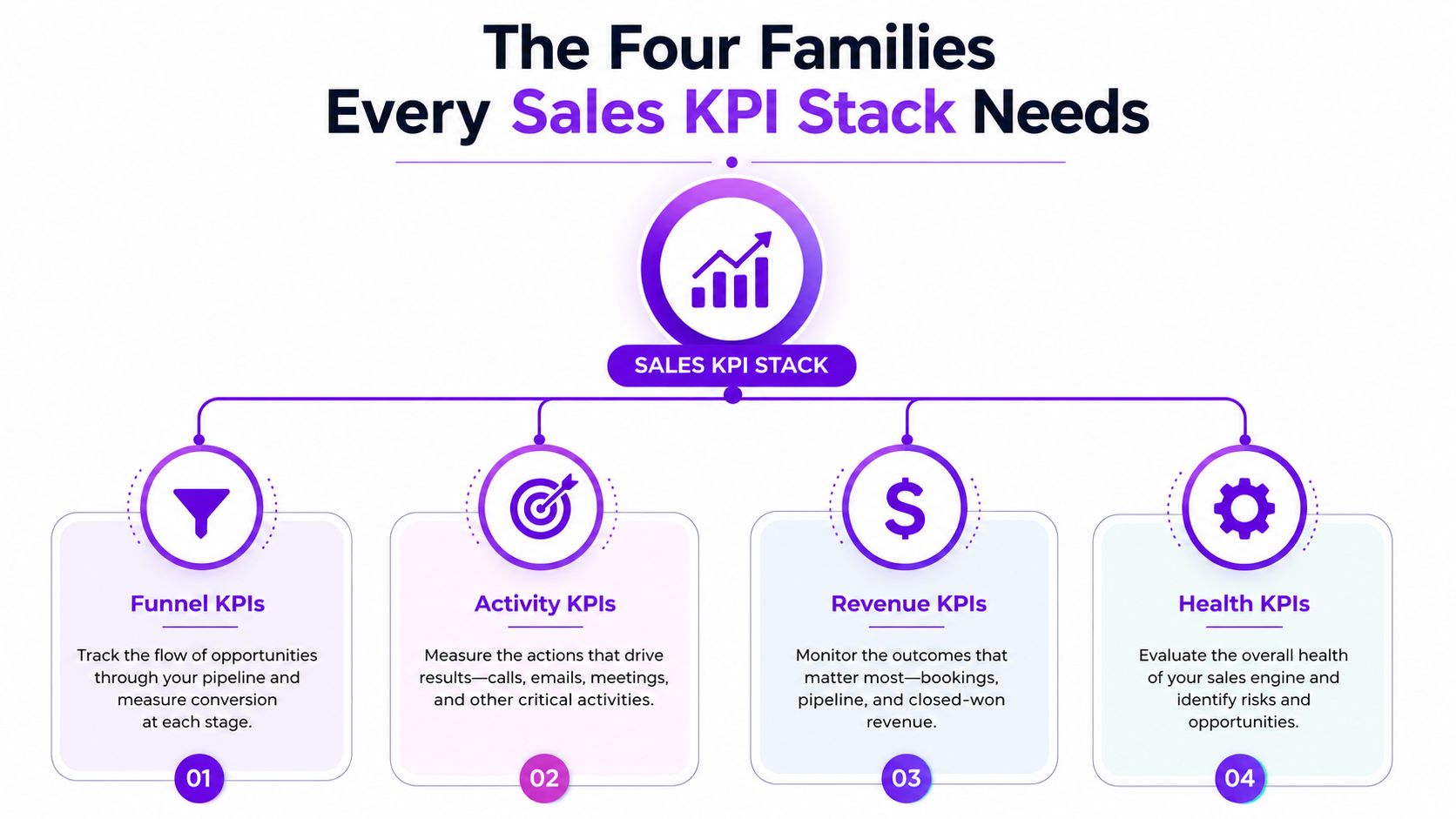
A clean stack layers these families instead of blending them into one soup. That is how you avoid the classic mistake of celebrating activity while missing the fact that the funnel is leaking. For teams that want a practical lens on contact and qualification work, DialNexa Labs Private Limited also publishes a Key Performance Indicators Sales guide that covers metrics such as Quote-to-Close Ratio, Pipeline Coverage Ratio, Lead Response Time, and Cost Per Lead.
Use a simple decision test. Ask whether the team is filling the funnel, working it, keeping the economics healthy, or hitting plan. If a KPI does not answer one of those questions, it is dashboard clutter.
Video walkthrough of the KPI family structure:
The Essential Sales KPIs With Formulas and Benchmarks
High-performing sales teams do not drown dashboards in vanity metrics. They track a short list of numbers that can answer one hard board question, will this motion produce revenue or just activity? Every KPI needs a formula, an owner, and a benchmark that tells you whether the number is healthy or drifting.
Use formulas that tie behaviour to revenue
Conversion rate shows how many leads turn into opportunities or customers, depending on the stage you measure. If 1,000 inbound leads produce 100 qualified opportunities and 20 closed deals, lead-to-customer conversion is 2%, while opportunity-to-win rate is 20%. That is the level of clarity leadership needs, because it shows exactly where the funnel breaks.
Quota attainment measures how much of target a rep or team delivers. If a team closes ₹7.5 crore against a ₹10 crore quota, attainment is 75%. That is the cleanest check on whether the plan is real or just hopeful arithmetic.
Pipeline coverage ratio is pipeline value divided by quota. A healthy planning range is 3 to 4 times quota, so a team targeting ₹10 crore in a quarter should carry ₹30 to ₹40 crore in qualified pipeline. That buffer matters because stage loss and slippage are normal, not exceptional. For a practical lens on this, see the key pipeline KPIs for SaaS guide, which covers the same stage-by-stage discipline sales leaders need.
Win rate is the percentage of opportunities or quotes that become closed-won deals. Average deal size is revenue divided by the number of deals won. Sales cycle length is the average time it takes a deal to move from creation to close. Lead response time measures how fast the team responds to inbound intent. Customer retention or expansion revenue shows whether the team is creating durable value after the sale.
The KPI set should also match the motion. If a team sells through long consultative deals, cycle length and win rate matter more than raw lead volume. If the motion depends on rapid lead handling, response time and qualification movement matter more. DialNexa's breakdown of different types of sales quota is useful here because quota design changes which KPI deserves the most weight.
Keep ownership clear enough for action
A KPI without an owner becomes reporting noise. An AE should own win rate and average deal size. An SDR should own speed-to-lead and qualification movement. A sales leader should own quota attainment and pipeline coverage. A RevOps lead should own consistency of definitions so the dashboard does not change meaning every quarter.
| KPI | Formula | Healthy Benchmark | Owning Role |
|---|---|---|---|
| Conversion Rate | Closed deals ÷ leads, or opportunities ÷ leads, depending on stage | A meaningful lift matters more than raw top-of-funnel growth | SDR, AE, RevOps |
| Quota Attainment | Closed revenue ÷ target | Use it as a target check, not a standalone story | AE, Sales Leader |
| Pipeline Coverage Ratio | Pipeline value ÷ quota | 3 to 4x quota | Sales Leader, RevOps |
| Win Rate | Won opportunities ÷ total opportunities | Track by segment and rep, not as one blended number | AE, Sales Leader |
| Average Deal Size | Closed revenue ÷ deals won | Benchmark by segment, city, and motion | AE, Finance, Sales Leader |
| Sales Cycle Length | Total days in cycle ÷ deals closed | Shorter is usually better, but only when deal quality holds | AE, Sales Leader |
| Lead Response Time | Time from inbound lead to first touch | Faster is better in high-intent motions | SDR, Inside Sales |
| Retention or Expansion Revenue | Existing customer revenue ÷ prior-period customer revenue | Track as a separate motion from new business | CSM, Sales Leader |
The board does not need eight charts to trust the number. It needs one page that shows where revenue comes from, where it slows down, and who owns the fix.
A board does not need eight charts to trust the number. It needs one page that shows where revenue comes from, where it slows down, and who owns the fix.
How to Set Targets Your Board Will Actually Trust
Targets fail when teams copy last year's number and add optimism. That's not planning, it's wishful arithmetic. The board trusts a target when it can see how quota, pipeline, and historical conversion rate add up to the same answer.
Start with quota, then work backwards
The cleanest method is to start with the revenue number, then test whether the pipeline can support it. Salesforce's guidance on pipeline coverage is the useful anchor here, 3 to 4 times quota is the normal planning range, because weaker coverage leaves too little room for stage loss (Salesforce sales KPIs). If a team needs ₹10 crore in a quarter, the working pipeline should sit around ₹30 to ₹40 crore.
That number is not magic. It only works if historical win rates and cycle length support it. If the team is carrying just 1.5x pipeline coverage, the shortfall tends to persist unless lead generation improves or the conversion rate climbs. That's why quota attainment alone is backward-looking. Pipeline coverage tells you whether the future is already underfunded.
Stress-test the target against ramp and seasonality
New rep ramp time changes the maths. A manager who ignores ramp will overpromise the quarter and then blame execution when the plan was faulty from day one. The same applies to sectors with uneven buying cycles, especially EdTech and real estate, where demand can swing with admissions periods, project launches, and local market behaviour.
Board rule: never approve a target until you can explain the pipeline source, the expected conversion, and the rep capacity behind it.
For teams that need to map quota structures more carefully, the different types of sales quota is a practical internal reference point because quota design shapes the incentive model, not just the forecast.
A simple target workflow works best. First, define quota by team and territory. Then calculate the pipeline coverage required to support it. Next, compare that number with historical conversion rates and average cycle length. Finally, adjust for rep ramp and seasonality before the number ever reaches the CFO.
The test is defensibility. If the CFO pushes back, the answer shouldn't be a story. It should be a chain of numbers that links pipeline to quota through actual conversion behaviour.
Choosing KPIs by Role and Industry
A sales KPI that makes sense for an SDR can be useless for a CSM. A metric that works in a Bengaluru SaaS team may be useless for a tier-2 real estate operation. That's why the smartest dashboards are role-specific, not universal.
Match the KPI set to the motion
For an SDR, the useful mix is usually one outcome KPI and a couple of activity or efficiency KPIs. The outcome might be meetings booked or qualified opportunities created, while the activity layer could be speed-to-lead and contact rate. For an AE, the focus shifts to revenue closed, win rate, and average deal size. For a CSM, retention, expansion revenue, and customer satisfaction matter more than top-of-funnel activity. For a CRO, quota attainment, pipeline coverage, and forecast confidence belong at the top.
That structure is not theoretical. Practical KPI design guidance from Didask recommends a maximum of 3 to 5 KPIs per role, which is the right way to avoid dashboard overload (Didask KPI commerciaux). I agree with that rule. Beyond that range, attention gets diluted and managers start arguing about definitions instead of performance.
Adjust the stack by industry, not just by title
In EdTech, the motion is often high-volume and response-heavy, so lead qualification, meeting booking, and conversion through counselling matter more than slow-cycle account expansion. In real estate, you care about lead-to-site-visit movement, call follow-up discipline, and average deal size by project or city. For a deeper operating playbook on lifting lead-to-booking conversion with AI, see this AI for real estate leads guide. In BFSI, compliance and verification often sit alongside conversion, so lead handling quality matters as much as win rate. In SaaS, pipeline quality and forecast accuracy usually matter more than raw call volume.
The same dashboard should not run a 1,000-seat enterprise sales team and a local property advisory team. That's how leaders miss the real operational problem.
For leaders working on inside sales motions, Inside Sales what is is a relevant internal read because inside sales stacks usually need tighter response and qualification KPIs than field-led teams.
The hard recommendation is this. Give each role 1 outcome KPI and 2 to 3 supporting KPIs. Then tune the mix by industry. That is enough for the manager to coach, enough for the director to forecast, and small enough that the team remembers what matters.
Voice-Led and Call-Heavy Sales KPIs Most Guides Miss
Most KPI guides stop at pipeline and win rate. That's a mistake in phone-heavy markets. If the team sells by call, the key operating metrics are about contact, conversation, and transfer quality, not just closed revenue.
Track the call path, not just the outcome
The first metric that matters is connect rate, the share of call attempts that reach a human. After that comes qualified-conversation rate, which shows how often a live call turns into an actual sales discussion. Agent hand-off rate tells you how often a conversation gets escalated to a closer, specialist, or next-step owner. Average handle time shows how long the conversation stays useful. Speed-to-lead matters because intent decays quickly when inbound demand is high.
Those numbers become operationally important in EdTech counselling, real estate discovery calls, BFSI verification, and healthcare appointment booking. A fast first response can separate a booked conversation from a lost lead, especially when the buyer is contacting multiple vendors at once.
AI changes the KPI mix, not just the workflow
A recent India survey found that 62% of organisations were increasing investment in AI, and 69% reported frontline employees were using AI at work, which signals that call handling is already changing across teams. That makes voice-led KPIs more important, not less, because leaders need to know whether AI-assisted routing and calling are improving qualification or just increasing volume (Pipedrive sales KPI discussion).
A useful interpretation is simple. If AI shortens response time but the qualified-conversation rate stays weak, the workflow is faster but not better. If connect rate rises and the hand-off rate improves, the system is doing real work. That's the kind of analysis standard dashboards rarely give you.
For teams handling voice-first workflows, sales tracking application is worth a look because call and follow-up instrumentation only works when the tracking layer is clean. DialNexa Labs Private Limited is one option in this space, since it builds Voice AI agents for qualification, customer support, recruitment, and presales workflows across sectors like EdTech, BFSI, real estate, hospitality, e-commerce, and software.
The bigger point is that India's UPI-scale digital buying behaviour makes contact speed commercially material. RBI data shows 16.99 billion transactions worth ₹23.49 lakh crore in June 2024 through UPI, which is exactly why speed-to-lead and qualification efficiency matter so much in high-volume sales motions (RBI payment-system data via Databox). When intent arrives in huge volumes, delayed response is not a minor operational miss, it's revenue leakage.
For teams running outbound calling as part of that motion, DialNexa's guide on measuring the success of outbound campaigns with an AI voice agent breaks down the connect-rate and qualification metrics that belong alongside these sales KPIs.
Dashboard Design and Reporting Cadence That Drives Action
A good KPI stack dies fast if the dashboard is built badly. Most leadership screens fail because they don't separate signal from drill-down. The right design is simple, visible, and ruthless about hierarchy.
Build the dashboard in three layers
The top layer should hold 3 to 5 headline KPIs only. These are the numbers that belong in a board or ELT view, usually quota attainment, pipeline coverage, win rate, sales cycle length, and conversion rate. The middle layer should break out funnel conversion by stage, because that's where the diagnosis lives. The bottom layer should let managers drill into role, segment, geography, and source so they can see whether the issue is a territory problem, a rep problem, or a motion problem.
That layout prevents one of the most common mistakes in sales reporting, mixing signal and explanation on the same screen. If the dashboard shows every detail at once, nobody knows where to look first. A clean hierarchy makes the meeting shorter and the follow-up sharper.
Set a reporting cadence that matches the buyer motion
Daily activity standups work for frontline teams. Weekly pipeline reviews work for managers. Monthly business reviews work for directors. Quarterly reads belong to the board and the executive team. That cadence keeps each layer focused on the right horizon, instead of forcing a monthly board deck to carry operational noise.
Practical rule: review activity daily, pipeline weekly, and revenue monthly. Anything slower, and you're already explaining last month's miss.
Voice-AI and conversation analytics should sit in the same reporting flow, not in a separate technology slide. Otherwise leaders see call quality in one place and conversion in another, then spend another meeting trying to connect them. The point is not to admire the data. It's to catch the problem while there's still time to fix the quarter.
A 30-Day Rollout Plan and the Mistakes That Break Forecasts
The fastest way to clean up a sales KPI stack is to cut it down and relaunch it with discipline. Don't try to fix everything at once. Fix the definitions first, then the dashboard, then the meeting rhythm.
Use a four-week rollout
Week 1, audit every KPI currently in use and retire the noise. If a number doesn't help forecast, coach, or decide, it goes. Week 2, align each role on 3 to 5 KPIs max, with one outcome metric and the rest supporting the motion. Week 3, rebuild the dashboard so the headline numbers sit at the top and drill-downs sit underneath. Week 4, run the first executive review against the new stack and force the team to explain the forecast with the new language.
That process works because it forces alignment before argument. Once the dashboard is smaller, the meetings get better. Once the meetings get better, the forecast gets cleaner.
Avoid the four mistakes that quietly break forecasts
First, don't track only lagging indicators. If the only signal is closed revenue, the quarter is already half over before you know there's a problem. Second, don't mix leading and lagging metrics on the same chart and pretend that creates insight. It usually creates confusion. Third, don't reward activity KPIs that don't correlate with revenue, because reps will optimise the wrong behaviour. Fourth, don't ignore call quality in phone-heavy motions, because speed without qualification is just a faster way to miss target.
If you want to pair sales forecasting with a dedicated model, Stimulead sales forecasting AI is a useful external example of how forecasting tools can sit alongside KPI design rather than replace it.
The forecast breaks when the dashboard rewards motion instead of progress.
A final check is easy. If your team can't explain why a KPI matters, who owns it, and how it affects revenue, then it doesn't belong on the executive dashboard. Keep the stack tight, keep the roles clear, and keep the board view brutally focused on revenue predictability.
DialNexa Labs Private Limited helps teams turn sales conversations into structured, measurable outcomes with Voice AI agents built for qualification, support, recruitment, and presales. If you're redesigning your sales KPI stack around speed, conversion, and call quality, visit DialNexa Labs Private Limited to see how voice-led workflows can fit into a cleaner dashboard and a more predictable forecast.

A very practical approach to sales KPIs, especially the focus on keeping dashboards simple and action-oriented.
This is a clear and practical guide to building sales KPIs that actually connect daily activity with revenue outcomes. I especially like the focus on fewer, role-specific metrics and actionable dashboards instead of overwhelming teams with data.