
Analyzing Sales Data for Business Growth
Analysing sales data shines a spotlight on where your budget really makes a difference. It uncovers trends in conversion rates, lead quality, customer lifetime value and churn rate. Armed with these insights, you can tweak your approach and see real growth. For VPs and CXOs, this guide demonstrates how analyzing sales data drives strategic decisions and board-level reports. For instance, a VP of Sales at a global SaaS firm used these insights to identify an underperforming channel, reassigning budget to high-converting markets and driving a 12% uplift in ARR.
Why Analysing Sales Data Matters
Getting clear on which channels underperform lets you funnel resources into what works best. Start by picking a handful of metrics that tie directly to your goals. From there, you’re building a solid base for decisions backed by real numbers.
Key Benefits:
- Better Forecasts: Watch conversion and churn patterns to tighten up your predictions—and present confident projections at quarterly board reviews.
- Smarter Spend: Use lead quality benchmarks to fund the highest-return activities—directors can reallocate six-figure budgets in hours, not weeks.
- ROI Clarity: Project lifetime value to know exactly where future revenue will come from, allowing CFOs to adjust cash flow models.
- Quick Reactions: Real-time tracking helps you pivot as soon as trends shift; one Director of Marketing spotted a 15% drop in demo requests and retooled creative within a day.
Monitor these metrics monthly and set targets that reflect realistic growth trajectories, then showcase progress in executive dashboards.
Process Flow For Sales Insights
The diagram below maps out how you go from metric selection to setting benchmarks and crafting action plans.
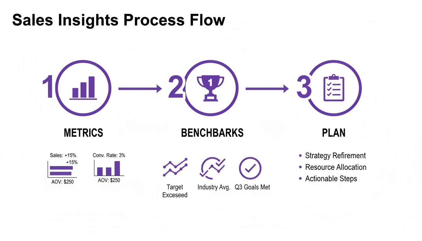
It’s a feedback loop: data informs your standards, standards drive your plans, and plans generate new data. In practice, a CXO review meeting uses this flow to align finance, marketing and operations teams on shared KPIs.
Key Sales Metrics Overview
Before you launch any new campaign, make sure everyone’s on the same page with these essential figures.
| Metric | Calculation | Business Impact |
|---|---|---|
| Conversion Rate | (Converted Leads / Total Leads) × 100 | Identifies funnel efficiency |
| Lead Quality Score | Weighted score of prospect attributes | Prioritises high-value leads |
| Customer Lifetime Value | Average revenue × Customer lifespan | Guides long-term investment |
| Churn Rate | (Lost Customers / Total Customers) × 100 | Reveals retention challenges |
Keep this overview close at hand as you set targets and rally your teams. You might be interested in learning more about unlocking brand growth strategies for D2C and e-commerce marketers to see how benchmarks translate into campaign wins.
At A Glance Action Plan
- Pinpoint the two metrics that matter most for your current goals.
- Match your results against industry benchmarks to spot gaps.
- Establish quarterly targets, then assign a named owner for each metric.
- Hold a concise monthly review to track progress and course-correct fast.
When teams see clear goals and ownership, budgets stop drifting into experiments that don’t pay off. A dashboard combining conversion, LTV and churn brings everything into view at once. Integrate these insights with voice AI routing tweaks or campaign tuning to lift your connect rates. Next up, we’ll dive into preparing and cleaning your sales dataset for truly robust analysis.
Preparing And Cleaning Your Sales Dataset
Insight accuracy depends on blending every sales source into one tidy dataset.
Take the case of a consumer goods VP who pulled together CRM exports, POS logs and payment records only to find mismatched field names. Catching that mix-up early saved weeks of rework and kept forecasts on point. Similarly, a Director of Data at a retail chain identified a misaligned currency code that corrected a $2M underestimation in projected revenue.

Merging Data Sources
Create a central staging area to land exports from your CRM, POS and digital wallets. Then:
- Map source columns to your master schema with a clear mapping table.
- Tag each row with source_system and import_timestamp for full lineage.
- Implement incremental loads so you only pick up new or updated records.
Integration Tips
- Validate schema adjustments on a test cluster before touching production data.
- Use a schema registry or version control to track evolving formats.
- Automate alerts when record counts change beyond a set threshold.
A director at a healthcare platform automated incremental loads and reduced nightly ETL runtimes by 40%, enabling next-morning analytics for the executive team.
Handling Missing Values And Outliers
First, run null checks on key fields like sales amount, customer ID and timestamps. Knowing where gaps live lets you choose the right fill strategy.
Impute thoughtfully:
- For stable metrics, median replacement often suffices.
- For continuous streams, time-series interpolation can bridge gaps.
- Spot outliers by calculating the interquartile range and flagging anything beyond 1.5× IQR.
Proactively handling outliers prevents skewed metrics and misguided strategic decisions.
Imputation Best Practices
- Document each rule with reasoning and thresholds for audits.
- Tag imputed records so teams can adjust analyses accordingly.
- Review your rules quarterly to reflect new patterns in the data.
One financial services Director reduced forecast variance by 8% after reworking imputation rules for seasonal gaps.
Timestamp Harmonisation
Converting every timestamp to UTC is your first defence against timezone mishaps.
- Rely on timezone-aware libraries such as Python’s
dateutilor JavaScript’smoment-timezone. - Standardise to ISO 8601 format (
YYYY-MM-DDTHH:MM:SSZ). - Manage daylight saving shifts by specifying explicit offsets or using library logic.
Sample Cleaning Script
Here’s a quick SQL example that filters out null sales and keeps only the latest record per order:
SELECT order_id, customer_id, sales_amount, import_timestamp
FROM staging_table
WHERE sales_amount IS NOT NULL
QUALIFY ROW_NUMBER() OVER (PARTITION BY order_id ORDER BY import_timestamp DESC) = 1
Always use parameterised queries to guard against SQL injection.
Calculating Weighted Channel Indices
Channels grow at different speeds, so you need to adjust raw sales to reflect those trends. Our VP applied normalisation factors so short-term UPI booms in modern trade didn’t skew the big picture.
Sales Channel Share And Growth Metrics
Below is a comparison of retail channel sales share, growth rates and normalisation factors for accurate trend analysis.
| Channel | Sales Share % | CAGR (2019–25) | Normalisation Factor |
|---|---|---|---|
| Kirana Stores | 75–78 | 5.2 | 1.00 |
| Modern Trade | 12–15 | 8.7 | 1.15 |
| E-commerce | 10–12 | 20.5 | 1.25 |
This breakdown shows why you can’t treat every channel the same when mapping insights to strategy. Apply the factor in your Python workflow:
df['weighted_index'] = df.apply(lambda row: row['sales_amount'] * row['normalisation_factor'], axis=1)
With 75–78% of sales in local kirana shops and only 10–12% online, channel-based segmentation becomes non-negotiable. Discover more insights about the India retail market on expertmarketresearch.com.
Validation And Final Checks
Before you move into analysis:
- Compare record counts before and after cleaning to ensure nothing dropped off.
- Enforce ISO 8601 timestamp checks on every import.
- Keep a living checklist of normalisation factors and update it as growth shifts.
Final Quality Checklist
- No duplicate order IDs remain.
- Date/time formats line up across all sources.
- Weighted index spread makes sense, without any channel dominating unexpectedly.
- All cleaning scripts are stored in version control.
- Regular audits are scheduled to catch silent pipeline errors early.
Once these checks pass, your data is primed for time-series modelling, cohort analysis and anomaly detection. For quick wins in feature engineering, explore 10 Python One-Liners That Will Simplify Feature Engineering.
Conducting Attribution Cohort And Time Series Analysis
When you’re dealing with high-volume sales data, precision matters. In this section, we’ll walk through practical ways to refine attribution, set up rolling cohorts and bake in real-world events for robust time-series forecasting.
Adjusting Channel Attribution Models
Marketing doesn’t stay still. To reflect shifting digital habits:
- Tag campaigns by channel, funnel stage and budget band.
- Give 30% credit to that first touch when awareness drives the funnel.
- Boost the final conversion touch to 50% during your busiest periods.
- Dive into device-level engagement each quarter and tweak weights accordingly.
Monitor these adjustments every month so spend follows performance. One BFSI VP shifted 25% of credit to app activation events, driving a 12% lift in conversions and reallocating $500K in paid search to in-app ads.
Executive Example On Attribution
A BFSI VP spotted that last-click heavily underplayed new app installs. After shifting 25% of credit to app activation events, conversions climbed by 12%. That uplift justified moving a slice of paid search dollars into targeted in-app ads.
Building Sliding-Window Cohorts
Rolling cohorts help you distinguish genuine retention from broad churn swings. Start by grouping customers around their week of first purchase, then chart active users across successive windows. Comparing cohorts formed during different promotions flags which campaigns really stick.
Here’s a quick SQL snippet for your analytics team:
SELECT customer_id, DATE_TRUNC('week', purchase_date) AS cohort_week FROM sales;
Cohort analysis surfaces subtle shifts that raw churn rates can hide.
Forecast Adjustments With Seasonality Flags
India’s retail market sits at USD 1.06 trillion for 2024–25 and is on track to hit USD 1.9–1.93 trillion by 2030—a 10–11% CAGR. Ignoring seasonal peaks or merger activity will skew your forecasts.
Here’s a snapshot of growth patterns:
Projected Retail Market Growth And Forecast Adjustments
Below are key figures for total market size, organised sector share and recommended adjustment methods.
| Year | Total Market Size (USD Trillion) | Organised Share % | Adjustment Focus |
|---|---|---|---|
| 2024 | 1.06 | 25 | Baseline seasonality |
| 2027 | 1.35 | 30 | Mid-term M&A flag |
| 2030 | 1.90 | 35 | Long-term structural |
By mapping seasonal peaks and landmark transactions, your models stay aligned with reality. Learn more on IBEF.
Embedding Forecast Parameters Into ARIMA Models
One finance team layered in promo lifts and price elasticity to sharpen their ARIMA outputs. They added a binary promo flag and set price sensitivity at –1.2 to isolate marketing impact:
model = SARIMAX(sales_series, exog=promo_flags)
results = model.fit()
Validate each quarter against live sales and adjust exogenous variables for ongoing accuracy.
Integrating Insights Into Executive Dashboards
A clear, scannable overview speeds decision-making at the top:
- Cumulative attribution waterfall highlighting channel shares
- Heatmap of cohort retention week by week
- Forecast line plotted alongside actuals and flagged events
- Core metrics like retention rate, lift and conversion delta
Bringing all these analyses into one dashboard helps C-suite leaders respond in real time.
Common Pitfalls And How To Avoid Them
- Overfitting weights that look good historically but fail in new campaigns
- Sliding windows so narrow they miss late adopters
- Skipping merger or regulatory flags and distorting future estimates
Actionable Next Steps For Executives
- Appoint an analytics owner to refresh attribution weights quarterly
- Automate sliding-window cohort queries and set up retention alerts
- Embed seasonality and M&A flags in every time-series model
- Review dashboard visuals at your monthly exec forum
Key Takeaways
• A robust tagging schema clarifies which channels drive results.
• Rolling cohorts expose genuine retention patterns.
• Embedding event flags can boost forecast accuracy by up to 15%.
• Unified dashboards enable faster, data-driven decisions.
Real-World Scenario Financial Services Forecast
A mid-market lender flagged a festive promo and saw a 9% deviation that matched actual uplift. They automated these flags in Python and tied deployments to their CI pipeline—now they catch seasonal spikes before they happen.
SQL Tagging Best Practices
Maintain clear naming conventions and version control. Store scripts in a repository with peer reviews. Comment each flag to explain why it exists and how it ties back to campaigns. That transparency builds confidence in your pipelines.
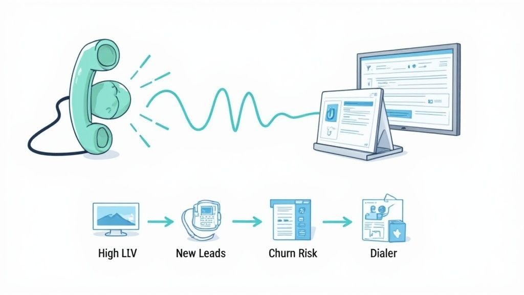
Applying Insight To Voice AI Campaigns
Once cohorts look solid, push them into the DialNexa API. You can then tailor voice scripts for high-value segments and lift qualification rates. Read also: Scaling Spend and Growing ROAS through Better Measurement
Visualizing Sales Trends And Spotting Anomalies
Numbers alone don’t move the needle. When you map sales data to visuals, patterns leap off the screen—conversion funnels, LTV heatmaps and churn alerts become clear signals rather than cryptic spreadsheets. That clarity lets VPs and CXOs spot both opportunities and risks in an instant.
Building Interactive Dashboards
First, decide which metrics guide your story. I usually start with conversion rate, average order value and churn rate. Then:
- Sketch out funnel charts that reveal each stage of your process.
- Add drop-down filters so directors can toggle between product lines, campaign sources or geographic markets.
- Layer on a heatmap showing cohort LTV across weeks or months.
For example, overlaying monthly churn spikes on a time-series graph helped one telecom CMO avert a pricing misstep that could have eroded 2% of ARR. And by colouring conversion dips in red versus growth in green, you direct attention exactly where it’s needed.
Selecting Anomaly Detection Methods
Catching weird data quirks early can save a bundle. In my experience, blending these techniques works best:
- Moving Z-scores to flag values drifting far from recent averages
- Seasonal decomposition residuals to unmask patterns hidden by regular peaks
- Threshold triggers that ping execs via Slack or email when a KPI crosses a critical boundary
A telecom operator I worked with spotted a sudden drop in lead quality days before a major campaign launch. That heads-up saved millions in wasted ad spend and kept performance on target.
By 2024, India’s e-retail GMV hit USD 60 billion with over 270 million online shoppers, pushing companies into near-real-time reporting and automated anomaly checks. Learn more about e-retail trends in India on Bain & Company.
The screenshot below shows an anomaly alert dashboard with funnel conversion rates and Z-score highlights.
It highlights a sudden drop in week-over-week LTV, prompting an immediate deep dive into underperforming segments.
Best Practices For Executive Friendly Visuals
High-contrast palettes guide the eye straight to critical metrics. In practice, I combine:
- Bar and line charts for side-by-side trend comparisons
- Heatmaps to reveal density and hotspots
- Narrative-led annotations that explain spikes or dips
Keep dashboards interactive so leaders can drill down by region or product. Then schedule automated email digests that surface only the most striking outliers and changes.
Dashboards should answer three questions: what happened, why it happened, and what we do next.
Interactive reports empower VPs to explore anomalies whenever they choose, reducing frantic one-off data requests. When execs see clear visuals alongside automated alerts, they shift from scrambling to steering with confidence.
Implementing Real Time Alerts
Automated alerts remove the need for manual checks. Here’s a quick approach:
- Pin down your critical KPIs and decide upper/lower thresholds
- Write a vectorised Z-score formula in your SQL layer to catch outliers
- Hook those alerts into channels your leadership actually uses (Slack, email, Teams)
SELECT
  date,
  ZSCORE(sales) AS z_score
FROM sales_data
WHERE ABS(ZSCORE(sales)) > 2;
Automated alerts free up your analytics team and keep execs focussed on decisions, not data wrangling.
Customising Visuals For Different Stakeholders
Different roles, different priorities:
- CFO View: emphasise monthly variance, burn-rate charts and forecast vs actual
- CMO View: spotlight channel attribution waterfalls and funnel drop-offs
- Operations View: surface time-series performance, support-call volumes, lead quality scores and churn alerts
Role-based views reduce noise and focus each executive on their own key KPIs.
By tailoring each dashboard, you ensure everyone from finance to marketing zeroes in on the insights that matter most—and takes action faster.
Turning Data Into Action With Voice AI Campaigns

Imagine guiding every call with insights that live beyond a dashboard. At DialNexa, you feed conversion rates and lead-quality scores straight into your IVR rules, so each interaction reflects real customer interest.
A BFSI team pulled a high-intent cohort via SQL, then clipped long prompts and adjusted pause timings. In just two weeks, call-to-booking conversions climbed by 8%. This is proof that analyzing sales data doesn’t stay stuck in reports—it drives real outcomes.
- Extract cohorts with SQL queries based on lead score and past behaviour
- Tag each segment in JSON for Voice AI ingestion
- Tweak script length and timing to mirror caller habits
- Set dynamic routing so top-value leads connect with senior agents
Integrating Audience Segments
Clean data exports are the foundation for precise campaigns. First, run a query such as:
SELECT customer_id, lead_score
FROM sales_data
WHERE lead_score > 80;
Next, convert results into the platform’s segment format:
{ "segmentName": "HighIntent", "ids": [123,456,789] }
Once you push this payload via API, your IVR applies those filters in real time. For senior managers, that means targeted campaigns fire off without any manual juggling.
Testing Routing Variations
Small routing changes can reveal big gains. Split your high-intent list into two groups:
- Group A flows through a revamped IVR script
- Group B goes straight to senior agents
Label each path inside DialNexa’s rule engine, then watch your executive dashboard for differences. Running these tests at scale often uncovers lifts of 5–10% when calls land in the right hands.
Systematic routing tests can unveil lifts of 5–10% in engagement when callers reach the optimal agent.
Automating Segment Exports
Waiting on manual exports slows you down and risks typos. Embed this snippet in your workflow:
curl -X POST https://api.dialnexa.com/segments
 -d "$(psql -t -c 'SELECT customer_id FROM sales_data WHERE lead_score>80')"
Keep the script in version control to guarantee consistency. Automation:
- Eliminates manual delays
- Prevents transcription mistakes
- Keeps segments fresh with hourly updates
Measuring Real-Time Uplift
Your dashboards should confirm improvements within minutes, not days. Focus on metrics like:
- Call connect rate
- Script completion rate
- Booking conversion percentage
Compare live figures against your baseline in a table:
| Metric | Baseline | After Optimisation |
|---|---|---|
| Connect Rate | 47% | 91% |
| Script Completion Rate | 65% | 82% |
| Booking Conversion Rate | 2% | 8% |
Real-time views help VPs and CXOs decide quickly which campaign variants to scale.
Drop these visuals into automated email briefs so stakeholders stay informed with minimal effort.
Next Steps For Executives
- Identify your top three segments by revenue impact and churn risk
- Draft JSON templates for dynamic IVR scripts and routing rules
- Schedule A/B tests with clear hypotheses and timelines
- Build hourly pipelines to refresh segment definitions
- Review live dashboards weekly and expand winning variants
Follow these actions and every insight becomes part of a voice-AI campaign that fuels measurable growth. Mapping your analysis to DialNexa is the final mile where data directly shapes customer conversations.
Avoiding Common Pitfalls In Sales Data Analysis
Working with sales figures can trip up even the most experienced teams. A tiny oversight in your analysis often leads to misallocated budgets and eroded stakeholder trust.
Chasing fleeting spikes in attribution models usually means you’re following noise instead of solid performance. And when campaign groups overlap, retention signals get blurred—often giving credit to the wrong channel for churn gains.
Here are some hands-on tactics to keep your analysis on track:
- Spot overfitting in attribution by testing model weights on fresh data and capping credit at a fixed percentage.
- Resolve cohort overlap by aligning cohort windows with campaign timelines and using exclusion flags.
- Monitor data latency by tracking ingestion delays and setting SLAs under 15 minutes for critical pipelines.
Version Control And Audit Trails
A scattered collection of SQL scripts quickly becomes a debugging nightmare. Centralising your cleaning routines, attribution rules and normalization factors in a git repository makes every change traceable.
I’ve seen a mid-market fintech miss a column update for weeks until an audit flagged inconsistent record counts. Automated diffs and scheduled checks catch that drift long before execs notice.
“Automated version control and regular audits saved us from a multi-week forecasting crisis,” says an analytics leader.
Practical versioning and audit tips:
- Keep all ETL and transformation scripts in a shared repo with clear, descriptive commits.
- Automate schema-diff checks so silent changes trigger real-time alerts.
- Generate weekly pipeline health reports highlighting record-count variances and timestamp gaps.
Managing Dashboard Filters And Intuition
Dashboards loaded with ad-hoc filters can confuse more than they clarify. Pin core filters for high-level metrics while leaving deeper dives open to variable parameters. That balance keeps your most important views consistent.
Stale data poses a bigger risk than slight delays. A retail VP I worked with once based a promotion on day-old sales and overspent by 23% before realising the lag.
When metrics swing wildly, trust a quick sanity check. Often a brief conversation outperforms chasing every data spike.
Best practices at a glance:
- Pin filters on major KPIs, use variable filters for exploration.
- Compare live versus delayed data streams to define acceptable lag windows.
- Encourage analysts to flag any metric that jumps more than 2× the standard deviation.
Consistent review routines and well-curated dashboards build confidence at the executive level. Turn these checks into your weekly ritual and you’ll turn potential pitfalls into growth opportunities.
“Consistent auditing and smart filters are non-negotiables for executive-level data credibility.”
Stay vigilant—insights thrive on discipline, not luck.
FAQ
Diving into sales data starts with pinning down objectives that echo your broader business targets. From there, pull together every relevant dataset—CRM exports, point-of-sale logs and digital payment records—into a single source of truth.
Before you run a single report, sweep through this data-cleanup checklist to keep things airtight:
- Validate null values in critical fields like order_id and sales_amount
- Remove duplicate records by matching transaction IDs
- Standardise timestamps to ISO 8601, tagging each with its timezone offset
- Annotate imputed entries so auditors can trace any adjustments
Once your data feels rock-solid, you can move on to selecting metrics and building out your reports. Always trial your process on a small dataset before kicking off a full-scale rollout.
Choosing The Right Metrics
Balancing outcome KPIs with process metrics helps you see both the finish line and the road there.
| Metric | Purpose |
|---|---|
| Conversion Rate | Funnel efficiency |
| Customer Lifetime Value | Project future revenue |
| Churn Rate | Retention health |
| Lead Quality Score | Prioritises high-value prospects |
Process metrics—things like lead response time or demo calls booked—are your daily dials. Align them with quarterly targets and hand off ownership so everyone knows their role.
Key Tools For Monitoring
Real-time visibility demands dependable BI platforms and alert frameworks. Consider:
- Power BI or Google Looker for bespoke dashboards
- Tableau when you need interactive visual analytics
- Threshold-based alerts via Slack or email, triggered by z-score anomalies
- API-powered pipelines that refresh data every 15 minutes
This setup keeps VPs and CXOs in the loop without extra manual effort.
Voice AI Integration
Bridging your analytics with DialNexa’s voice-AI segments can dramatically lift call performance.
“Integrating analysis with voice routes boosted connect rates from 47% to 91%,” shares a client lead.
To make it happen:
- Extract cohort IDs using SQL, then export them in JSON format
- Automate segment uploads through scheduled API calls
- Define dynamic routing rules so senior agents handle your top prospects
- Run A/B tests on call scripts and track booking conversion rates
This approach ensures your voice campaigns stay in sync with the latest insights, nudging conversion rates higher every week.
Get started today with DialNexa and turn your sales data into smarter voice-AI actions.
[…] a practical baseline, DialNexa's guide to analyzing sales data covers the sales inputs teams should clean up before adding prediction layers. It also helps to […]
[…] a clear, motivating journey to full productivity. For a deeper dive into this process, our guide on analysing sales data effectively is an excellent […]
[…] Teams also need a single reporting rhythm. A fragmented reporting environment produces avoidable arguments over attainment, pacing, and accountability. Leaders trying to tighten this process can benefit from a structured approach to analysing sales data. […]